All projects

CASE STUDY

1st Blessed Adult Family Home

Residential care, United States

A care home site built for the families reading it: bigger text, a warmer palette, and a blog the home runs itself.

Role
UX redesign and frontend engineering
Disciplines
Research, information architecture, design system, build
Surfaces
Eight public pages, plus the editor

THE PROBLEM

Where this started

1st Blessed is an adult family home in the United States. The people reading the site are usually adult children looking into care for a parent, often sitting next to that parent, and usually having a hard week.

  • 01Care home sites are written for the industry rather than for the family. They open with licensing and capacity when the question being asked is a much simpler one, which is whether Mum will be alright here.
  • 02A good share of the people reading this are sixty five or older, on a phone, and the sixteen pixel text that every framework gives you by default is simply too small for them.
  • 03What makes a home feel real is seeing what happened there last month, and nothing stays current if publishing it means phoning a developer.
THE FIRST VERSION

There was a version before this one

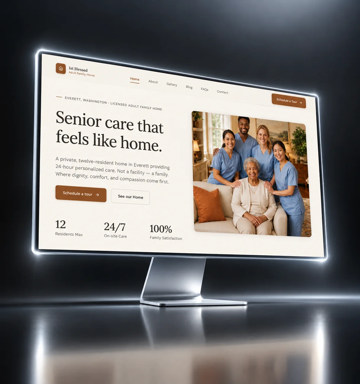
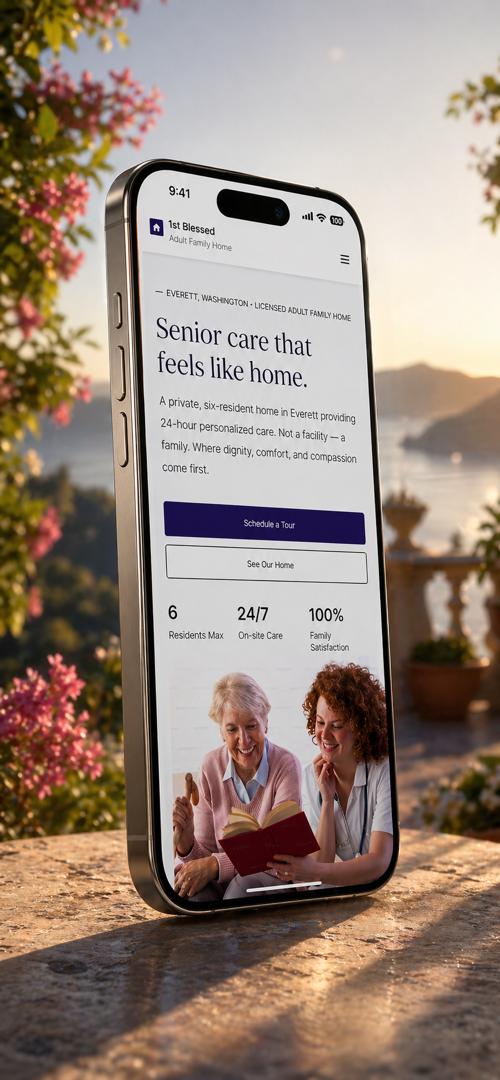
Before the build, I prototyped the site in Framer so the home could react to something clickable. When their brand arrived and the audience became clearer, most of it was replaced.

Open the Framer prototype
The first version of the 1st Blessed site, as an interactive Framer prototype
  • The brand arrived, so the system was rebuilt around it

    The prototype used a placeholder palette. When the home's brand arrived, colour, type and spacing were redrawn around it.

  • Larger type for the people reading it

    The prototype was set tight. The readers are adult children in their fifties and sixties, often on a phone, so the build moved to a larger base size and more line spacing.

  • The gallery became a carousel you can swipe

    A stacked photo grid is a long scroll on a phone. The build uses a swipeable carousel.

  • The FAQs got topic filters

    One long column of questions works with eight and fails with thirty. The build groups them by topic with filters.

  • The contact form moved from Formspree to Resend

    Formspree was fine for a prototype. Resend gave control over how messages are composed, where they go and what happens when sending fails.

  • The home got to own the words

    Nobody at the home could edit the prototype, so the build started with a content model and a CMS the home publishes from.

THE DECISIONS

What I decided, and why

Each decision, why I made it, and what it cost.

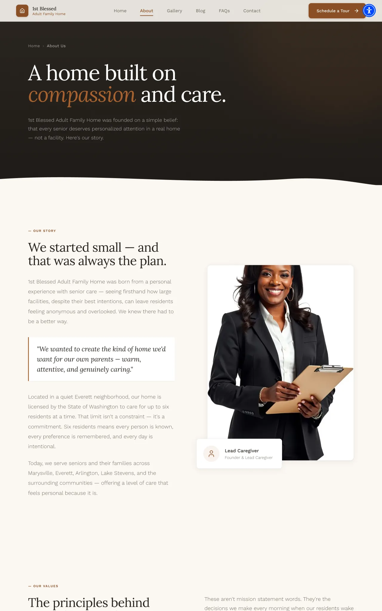
The About page set on an eighteen pixel base
01

I made the base text size eighteen pixels instead of sixteen

Why

Many readers are in their sixties and seventies, on a phone. Sixteen pixels is a framework habit, not a finding.

What it cost

Every size and gap is measured from eighteen, so the whole site is a step larger, not just the headings.

02

Warm colours instead of clinical blue

Why

Blue says institution. A family is choosing a home for someone they love, not a ward.

What it cost

A warm off white with a clay accent, plus a darker clay kept for text so it stays readable.

03

A serif for the voice, a sans for the facts

Why

The site has to sound like people and read like a reference. One typeface cannot do both.

What it cost

Lora for headings, Work Sans for body, navigation and forms.

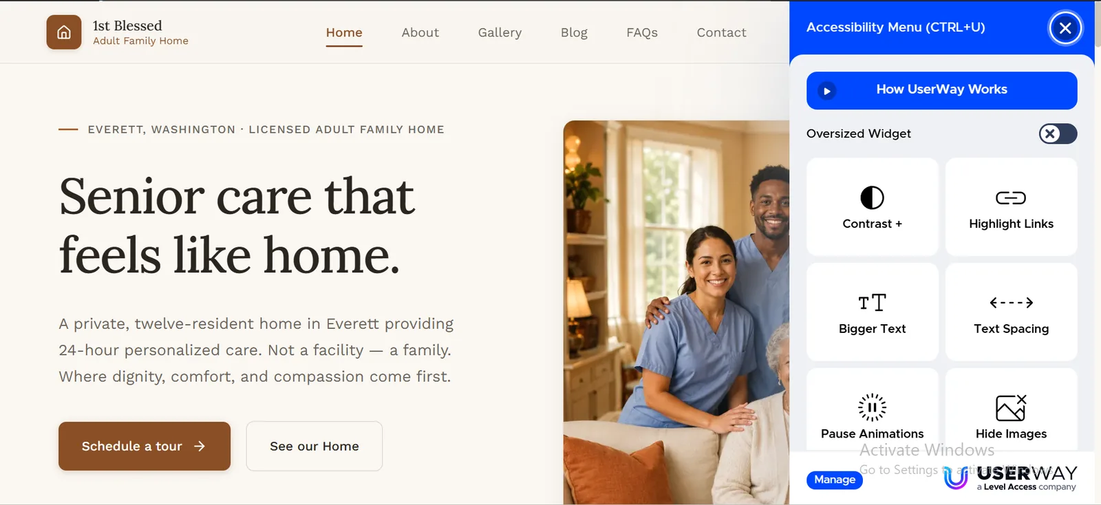
The accessibility widget open on the site
04

An accessibility widget on top of accessible markup

Why

A seventy year old on a borrowed tablet has no screen reader set up and should not have to dig through settings.

What it cost

A third party widget on an otherwise light site. It costs page weight, and I took that because of who is reading.

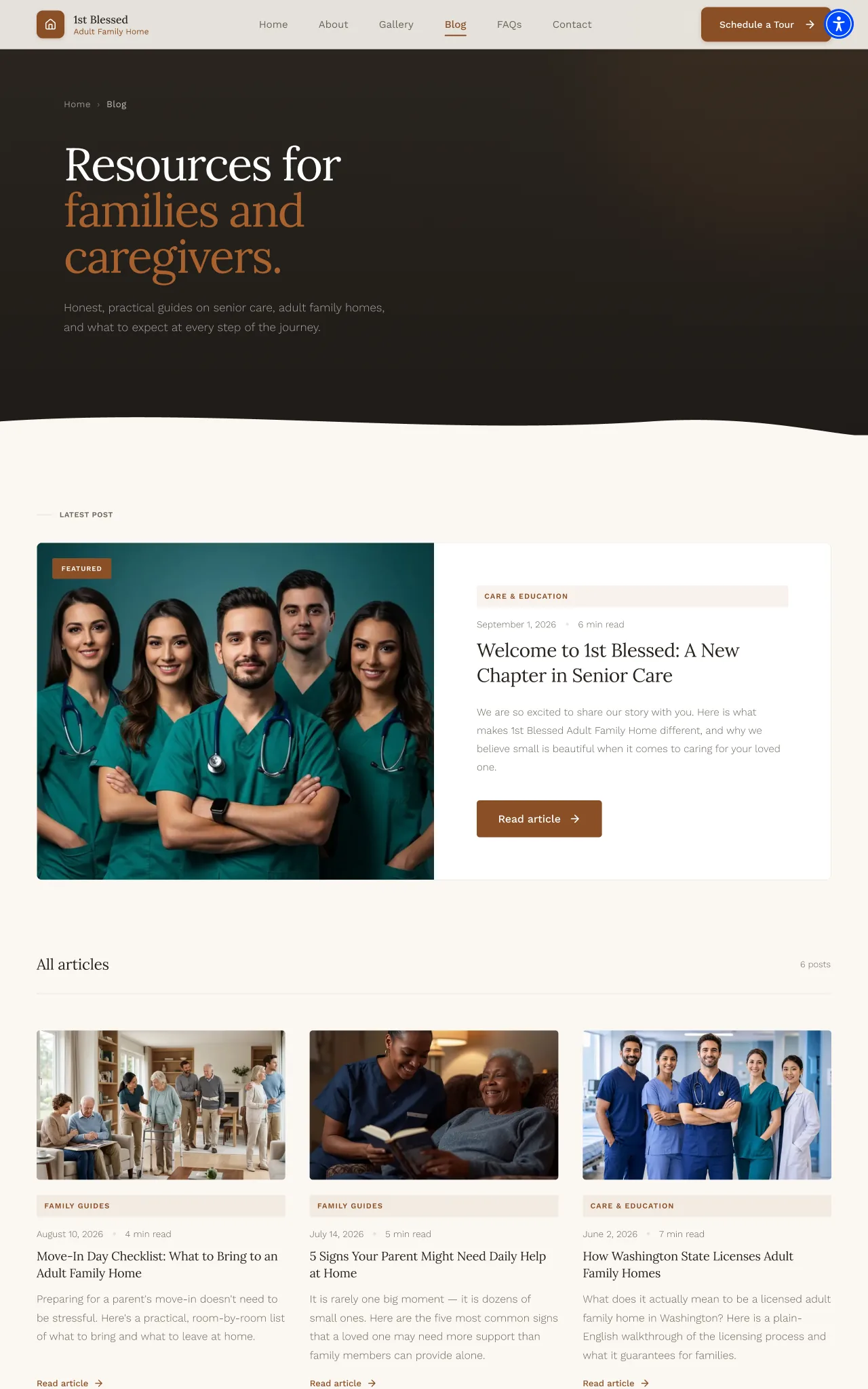
The blog index with recent posts
05

A blog the home runs without me

Why

A recent photo and a recent post make a home credible. Anything that needs a developer stops being updated.

What it cost

A simple post type staff can publish themselves, kept separate from the gallery.

THE DESIGN SYSTEM

The pieces it is built from

A warm neutral background with a clay accent, all measured against an eighteen pixel base so the whole site runs a step larger than usual.

Colour

Warmth#faf7f2Page ground
Warmth raised#ffffffCards and panels
Ink#2b2620Primary text
Ink secondary#6b6459Body and support
Ink tertiary#a49b8dSmall labels
Accent#a8622fAccent and interactive
Accent text#8a4f26Accent inside a sentence
Border strong#2b2620Rules, at 20 percent

Typography

The voice

Lora

Headings, and the odd aside in italic. Three weights with both roman and italic, pulled in slightly at larger sizes so a long heading still holds its line.

The facts

Work Sans

Body copy, navigation, the questions page and every form field. Three weights, set with generous space between the lines, which at an eighteen pixel base makes for a noticeably open paragraph.

Rules I stuck to

  • The base text size is eighteen pixels, so everything measured against it inherits a larger starting point.
  • The warm accent exists twice, once for backgrounds and once darkened for text, so it never turns up in a sentence at a contrast it cannot hold.
  • Depth comes from a single raised white against the warm background, not from drop shadows.

THE BUILD

Have a look at the build

The build is finished and deployed. The home has not moved it to their own domain yet.

1st-blessed-afh.vercel.app/
1st Blessed Adult Family Home, the deployed site Open the build

HOW IT WAS BUILT

How it was built

Design
FigmaFramer
Frontend
Next.js 14TypeScriptTailwind CSS
Content
Sanity CMSPortable Text
Forms
Resend
Motion
GSAPFramer Motion
  • The editor lives inside the site, so the home has one address to remember.
  • The sitemap and robots file are generated from the pages, so new pages are findable straight away.
  • Privacy and terms pages use the same type system as the rest of the site.

THE OUTCOME

Where it ended up

  • Eight pages covering the home, the people, the photos, the blog, the common questions and how to get in touch, with an editor built for the home to publish from directly.
  • Text one step larger than a default build.
  • A generated sitemap, a robots file, and real privacy and terms pages.
  • A warm palette with a clay accent that passes contrast wherever it carries text.
Download CV