All projects

CASE STUDY

Atelier

Architecture and interior design studio

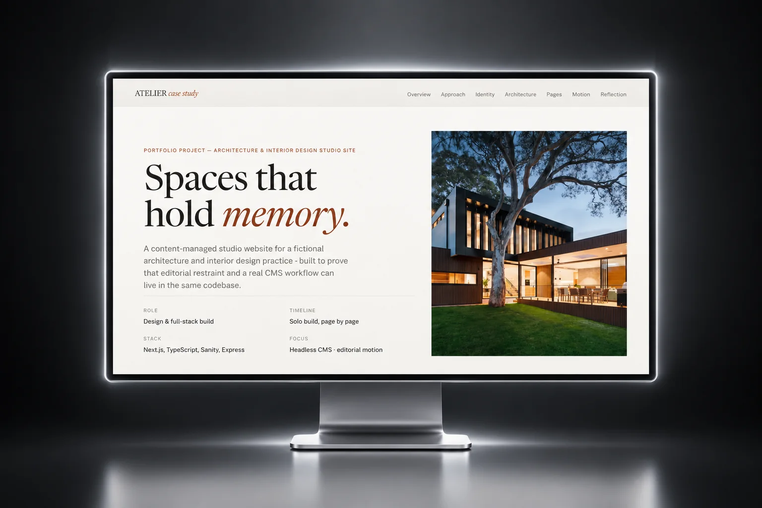
An editorial site for an architecture studio, with a CMS the partners publish projects from themselves.

Role
Product design and frontend engineering
Disciplines
Information architecture, design system, interface, build
Surfaces
Five routes, plus the editing environment

THE PROBLEM

Where this started

Atelier is a high end architecture and interior design studio. Their work is photographic and slow, and the site needed to read like a book about the studio.

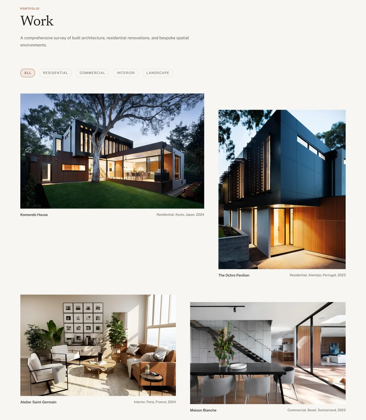
  • 01The photography is the point of a studio site, but when every project sits in a box of the same size, nothing stands out.
  • 02The partners are architects, not developers. If adding a project means emailing me, the site stops being updated.
  • 03The design called for a lot of motion, which can make a site hard to use with a keyboard or with reduced motion turned on.

THE DECISIONS

What I decided, and why

Each decision, why I made it, and what it cost.

The work page grid, with projects at seven, five, six and six columns
01

I let some projects take up more room than others

Why

Some projects matter more to a studio than others. Giving one more of the grid says so before anyone reads a caption.

What it cost

The card takes its width as a setting instead of being two components. The home page runs seven and five columns, the work page cycles seven, five, six, six, and a gallery image can take all twelve.
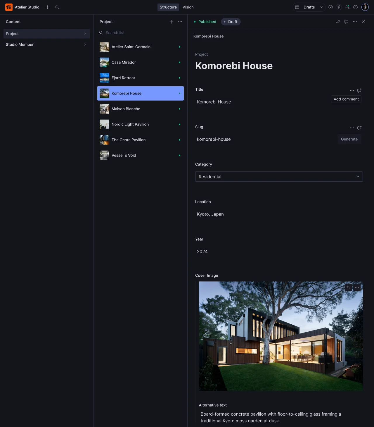
The Sanity editor with the Komorebi House project open
02

I built the content model before I designed a single page

Why

The content model decides what the site can say. Designing pages first leads to a CMS full of free text fields that are hard to lay out.

What it cost

There are two content types, a project and a studio member. Running order is a plain number the partners set themselves.

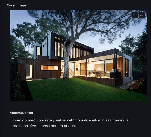
The cover image field with its required alternative text
03

I made alt text a required field

Why

Alt text gets skipped on a busy week unless the system requires it.

What it cost

An image cannot be published without a description, on the cover or in the gallery.

04

Clicking a photo moves you closer to it

Why

Opening a project should feel like moving closer to the photograph, not loading a new page.

What it cost

The animation removes the element you clicked, which would leave keyboard users with no focus. When it finishes, focus moves to the project heading.

05

One colour, and it has a job

Why

On paper and charcoal, one warm colour can mark everything interactive: links, focus rings, the active filter.

What it cost

Clay is the only non neutral colour, so it always means interactive.

THE DESIGN SYSTEM

The pieces it is built from

Paper and charcoal, with clay as the only accent.

Colour

Paper#f7f5f1Page ground
Paper raised#ffffffCards and panels
Charcoal#1c1a17Inverted sections
Ink#201e1aPrimary text
Ink secondary#625d54Body and support
Ink tertiary#a39c8fSmall labels
Clay#a8532fAccent, rules, focus
Clay text#8a3f22Accent on paper, 6.85 to 1

Typography

Headlines and editorial

Newsreader

A serif with optical sizing. Headings at 400 and 500, italic for emphasis, tighter letter spacing at display sizes.

Everything functional

Public Sans

Two weights, 400 and 500, for labels, small print and navigation.

Rules I stuck to

  • Twelve columns, with widths that cycle seven, five, six, six.
  • One shared reduced motion check for smooth scrolling, image reveals and the page transition.
  • Every colour pairing checked with the contrast formula.

THE LIVE PRODUCT

Have a look at the real thing

This one is live, not a mockup. Open it and you are looking at the decisions above, running.

atelier-frontend-liard.vercel.app/
Atelier, the deployed site Open the live site

HOW IT WAS BUILT

How it was built

Design
Figma
Frontend
Next.js 14TypeScriptTailwind CSSGSAP
Content
Sanity CMSPortable Text
Backend
ExpressSQLite
  • The site, the editor and a small enquiry server deploy separately, because they change at different times.
  • Most components are under 100 lines. The largest is the enquiry form at 186.
  • Data is fetched once per page and passed down, so no component queries the CMS on its own.

THE OUTCOME

Where it ended up

  • Five pages and one content model, with an editor the studio publishes from directly.
  • Clay text on paper measures 6.85 to 1, well above the standard for body text.
  • Keyboard focus survives the page transition.
  • One colour failed. The lightest grey reaches only 2.50 to 1 on paper and is used for small labels. Darkening it to #767063 brings it to 4.52 to 1.
Download CV