All projects

CASE STUDY

JTAH Foundation

Welfare of women and the girl child, Nigeria

A foundation site with four different ways to help, and a donation that finishes here rather than on somebody else's page.

Role
Interface design and frontend engineering
Disciplines
Information architecture, design system, payments, build
Surfaces
Ten public pages, plus the editor

THE PROBLEM

Where this started

JTAH has worked on the welfare of women and the girl child in Nigeria since 2000. The site has to win donors who give again, not one time gifts driven by guilt.

  • 01Foundations in this space often lean on urgency: red, black and distressing photos. It raises money once, rarely twice.
  • 02People arrive wanting different things. Someone willing to give a Saturday, someone who can introduce a partner and someone ready to donate today are three different people, and one contact form loses two of them.
  • 03Sending donors to a payment page on another site loses many of them.

THE DECISIONS

What I decided, and why

Each decision, why I made it, and what it cost.

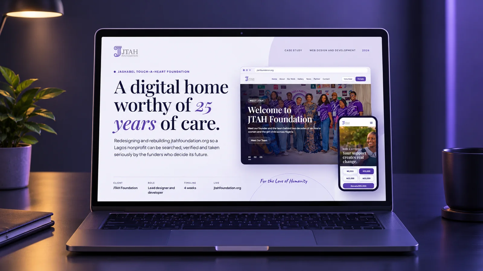
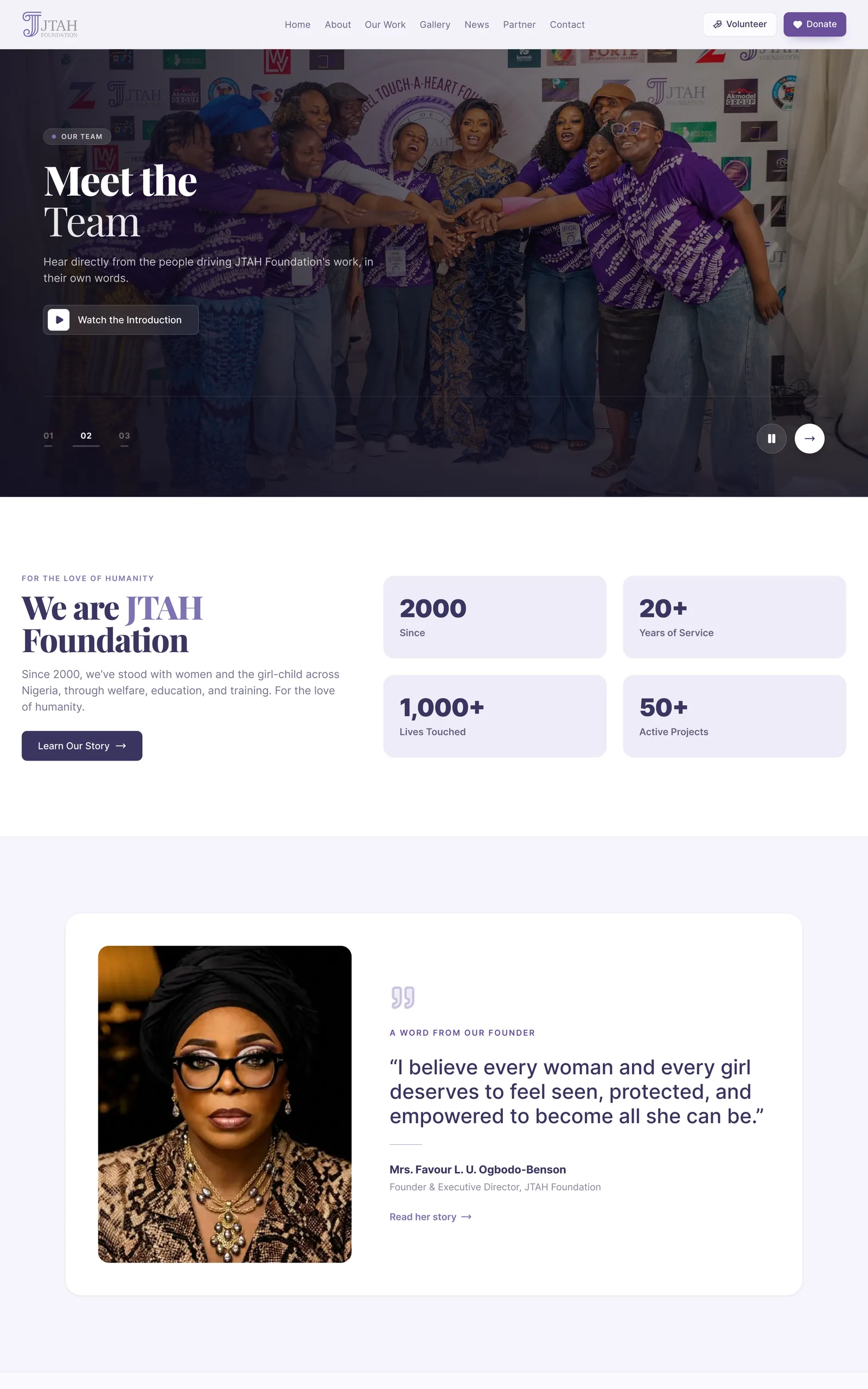
The JTAH site in lilac and indigo
01

Lilac and indigo rather than red and black

Why

A foundation asking people to stay has to look like it will be here next year, not like an emergency appeal.

What it cost

Six colours. One mid lilac for everything interactive and deep indigo for text, so nothing else competes for attention.
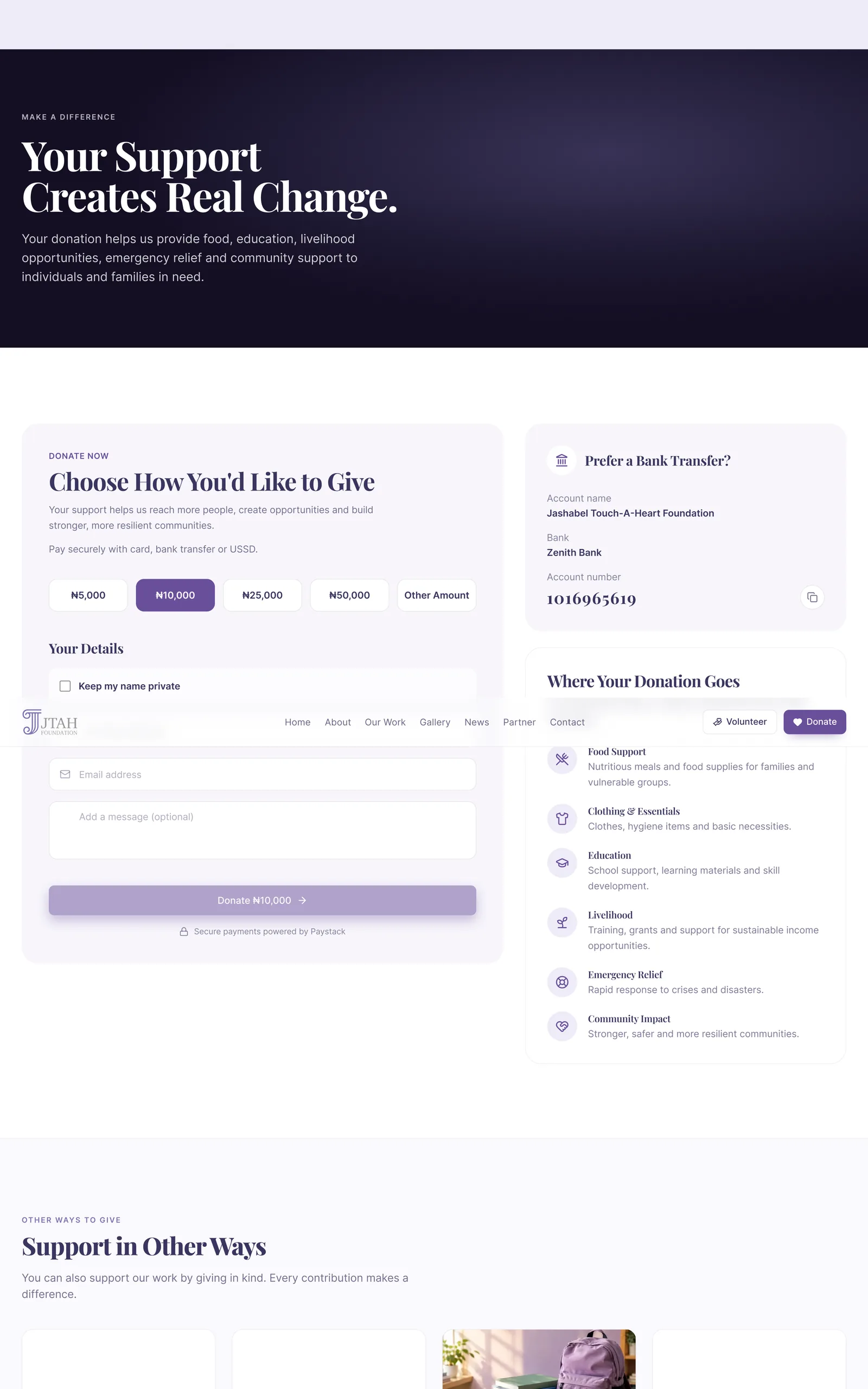
The Donate page
02

Four ways to help, each with its own page

Why

One contact form loses the people not ready to donate today, and over a few years they are often worth more.

What it cost

Donate, volunteer, partner and contact each ask one thing. Volunteer has a page per role, and contact arrives with the subject filled in from wherever the visitor came from.

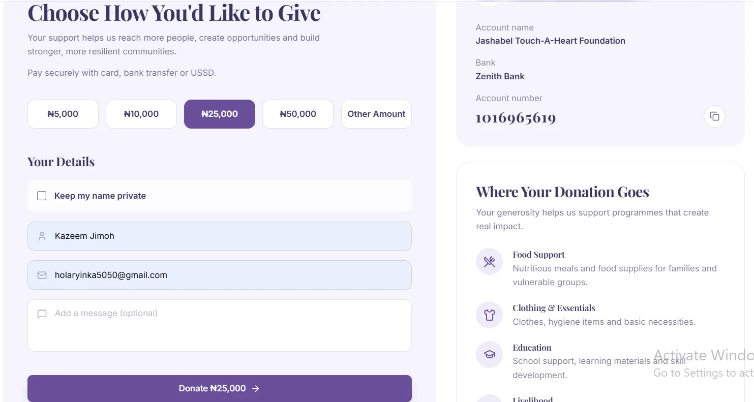
The donation form with an amount selected
03

The donation finishes on the site

Why

Every jump to an outside checkout is a chance to lose a donation.

What it cost

Paystack runs in place, and the server confirms the payment itself, so a thank you screen always means the money arrived.

04

Three typefaces, each with one job

Why

A foundation has to sound credible and human at once.

What it cost

Playfair Display for headlines, Inter for everything practical, and a handwritten face in a few places where the foundation speaks for itself. Any more often and it becomes a greeting card.

05

One headline size that stretches rather than jumps

Why

The opening line has to land on a phone and a large monitor without being designed twice.

What it cost

It scales smoothly with the screen instead of switching at set widths.

THE SCREENS

More of the site

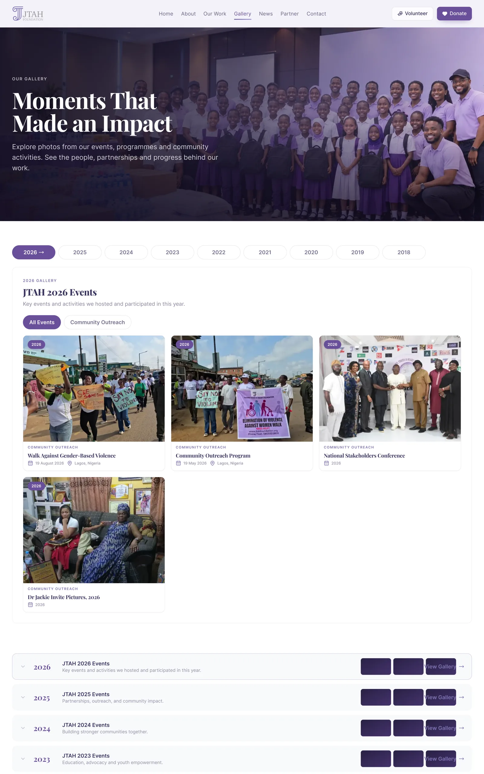
The gallery and events page, sorted by year
The gallery, where twelve years of photographs live in albums by year, managed by the foundation.
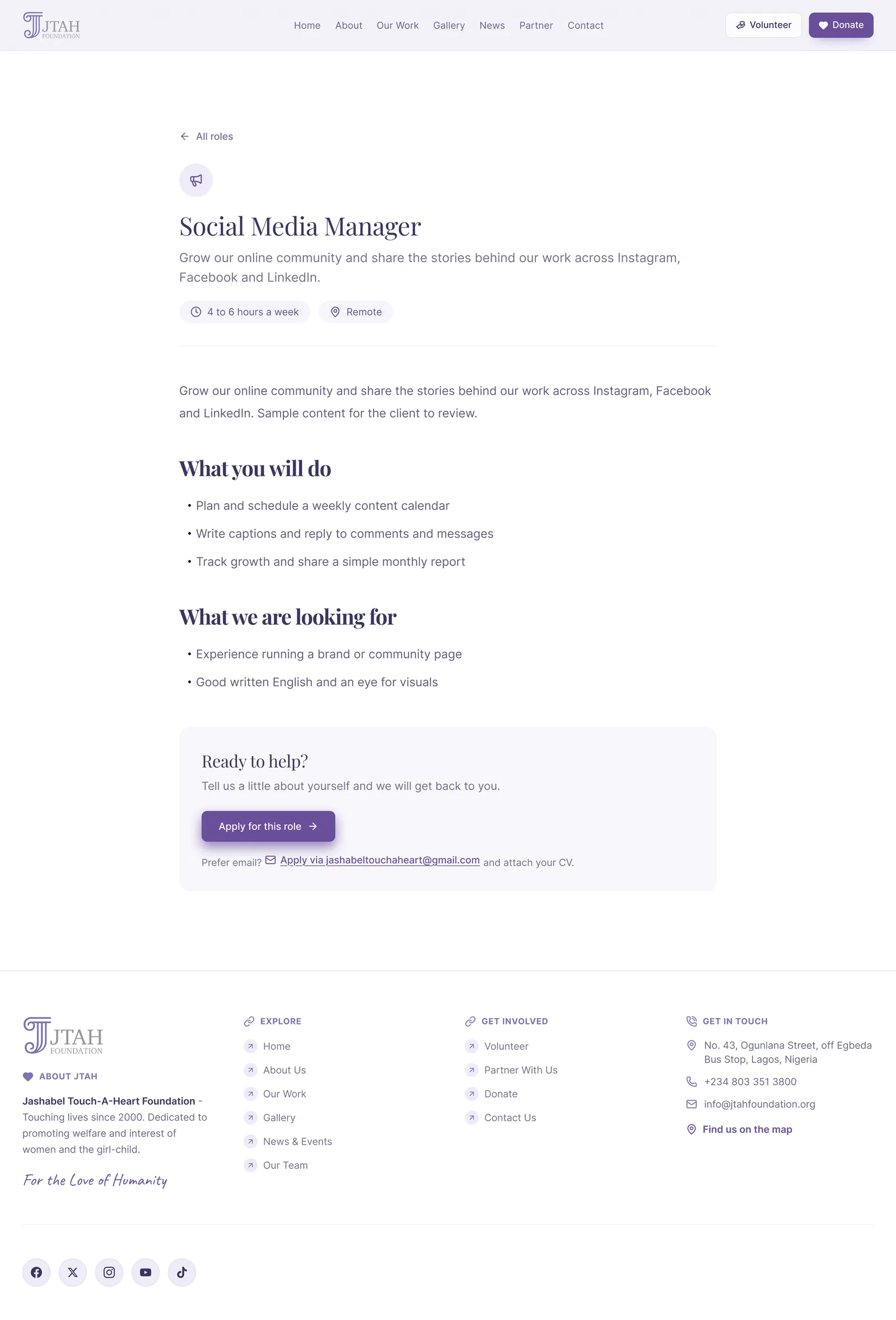
A volunteer role page with its own application
Each volunteer role has its own page and its own application.
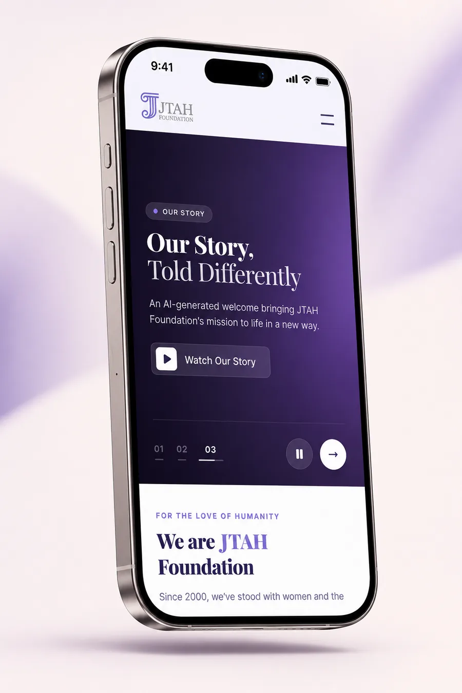
The JTAH homepage on a phone
The homepage on a phone.

THE NEXT EXPERIMENT

A/B tests built on live tracking

Google Analytics already counts three actions on the live site: a completed donation, a contact message and a volunteer application. Each test is designed around one of them, with a single metric, a guardrail and a rule for what ships.

01

Should the donate form suggest ₦10,000 or ₦20,000?

How

Control: ₦10,000 preselected, as the form ships today. Variant: ₦20,000 preselected. Visitors split at random, half and half, for four weeks. Primary metric: average gift. Guardrail: share of visitors who finish a donation.

What would change the design

₦20,000 becomes the default only if the average gift rises and the finish rate holds. Otherwise ₦10,000 stays.

02

Should the homepage button say Donate or Support our work?

How

Control: Donate. Variant: Support our work. Visitors split at random, half and half. Primary metric: finished donations from homepage visitors, not clicks, so a vague label cannot win on curiosity.

What would change the design

The label with more finished donations ships. A tie keeps Donate, because it is the clearer promise.

THE DESIGN SYSTEM

The pieces it is built from

Six colours. A lilac background, a deep indigo for text, and one mid lilac for everything you can click.

Colour

Lilac tint#eeecf7Page ground
White#ffffffCards and panels
Lilac mid#7c74b2Accent, selection, interactive
Indigo deep#3a3560Primary text
Text secondary#3a3560Support copy, at 65 percent
Border#3a3560Rules, at 12 percent

Typography

Headlines

Playfair Display

The opening line and every section heading. It stretches smoothly from phone to desktop rather than jumping at set widths, with the letters pulled tight so a big heading reads as one thing.

Everything practical

Inter

Body copy, navigation, forms, the donation flow and all the small print. It is the typeface the site spends most of its time in, which is exactly why it never draws attention to itself.

The human note

Caveat

A handwritten face kept back for a small number of moments where the foundation speaks as itself. Its whole value comes from how rarely it shows up.

Rules I stuck to

  • Quieter text and the dividing lines are the same indigo faded back, so the palette stays at six colours instead of growing a whole set of greys.
  • Big text stretches with the screen rather than switching at set widths, so a headline is one piece of typography everywhere.
  • Form checks are written once in one place rather than scattered through the components.
  • Carousels stop when someone hovers or tabs into them, and they do not move at all for a visitor whose device has asked for reduced motion.

THE LIVE PRODUCT

Have a look at the real thing

This one is live, not a mockup. Open it and you are looking at the decisions above, running.

jtahfoundation.org/
JTAH Foundation, the deployed site Open the live site

HOW IT WAS BUILT

How it was built

Design
Figma
Frontend
Next.js 15React 19TypeScriptTailwind CSS
Content
Sanity CMSPortable Text
Payments
PaystackWebhooks
Forms
ResendZod
Motion
GSAPLenis
Quality
Playwright
Measurement
Google Analytics 4Search Console
  • Starting a donation and confirming one live in separate places on the server, so the part that takes money and the part that verifies it can never be confused.
  • The form checks are written once and shared, so a form and the code receiving it cannot drift apart.
  • Around forty four tests run against the live site after every deploy, on desktop and mobile, with analytics kept out of the runs.
  • Security headers set and the main branch protected, so nothing reaches the live site without a pull request.
  • Social preview images are generated by the pages themselves, so a shared link never loses its picture.

THE OUTCOME

Where it ended up

  • Four separate ways to support the foundation, each with its own page and its own ask.
  • Donations that start and finish on the site, confirmed by the server rather than the browser.
  • The foundation runs its own pages, news, events and gallery, including around five hundred and sixty photographs from 2013 to 2025.
  • Three actions counted from day one: a donation, a contact message and a volunteer application, so the foundation can see which route works.
  • Years of search traffic kept through the move off the old site, with every old address redirected to its new page.
Download CV