All projects

CASE STUDY

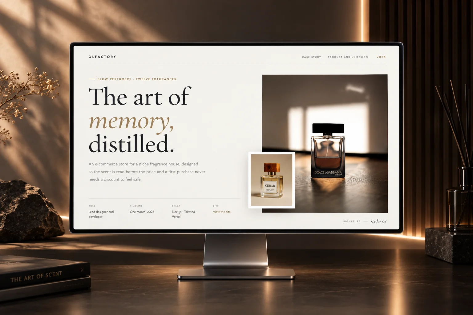
Olfactory Fragrance

Slow perfumery, sold direct

A perfume shop that leads with the scent, not the price, and offers a sample set instead of discounts.

Role
Lead designer and developer
Timeline
Two months
Disciplines
Product design, design system, checkout flow, build

THE PROBLEM

Where this started

Olfactory is a small perfumery. The range is small and not cheap, and a website cannot let you smell anything.

  • 01A grid of bottles tells you almost nothing about how a perfume smells.
  • 02A first bottle is an expensive risk, and the usual fix, a discount, suggests the range is overpriced.
  • 03So the writing has to do the work photography usually does.

THE DECISIONS

What I decided, and why

Each decision, why I made it, and what it cost.

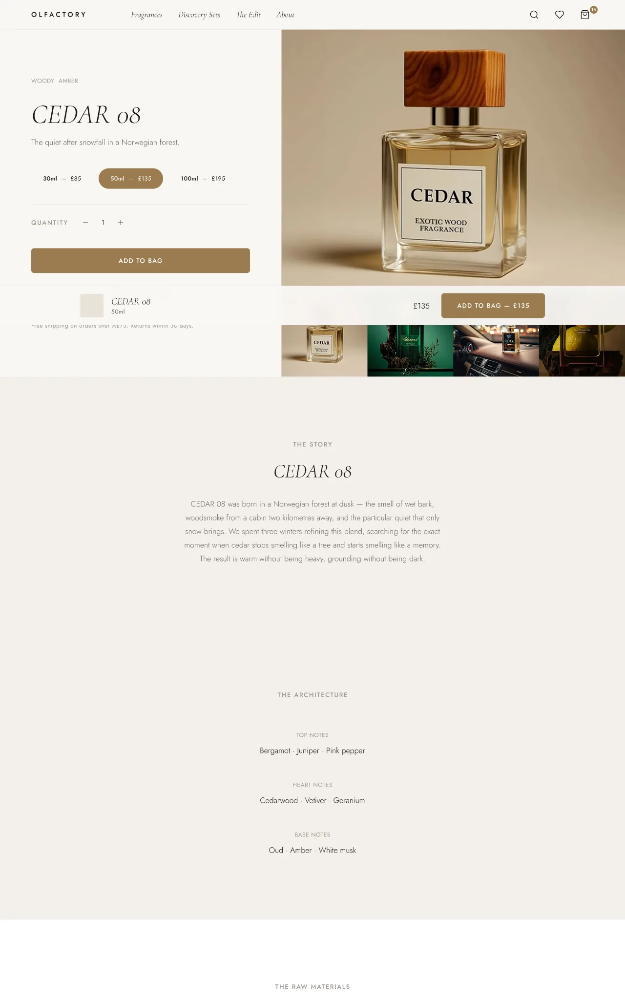
A product page with the scent family and notes above the price
01

You read the scent before you see the price

Why

When the price comes first, people judge the value. When the notes come first, they imagine the scent.

What it cost

Each card reads scent family, name, then price, with the name in display italic and the family as a small tag above it.
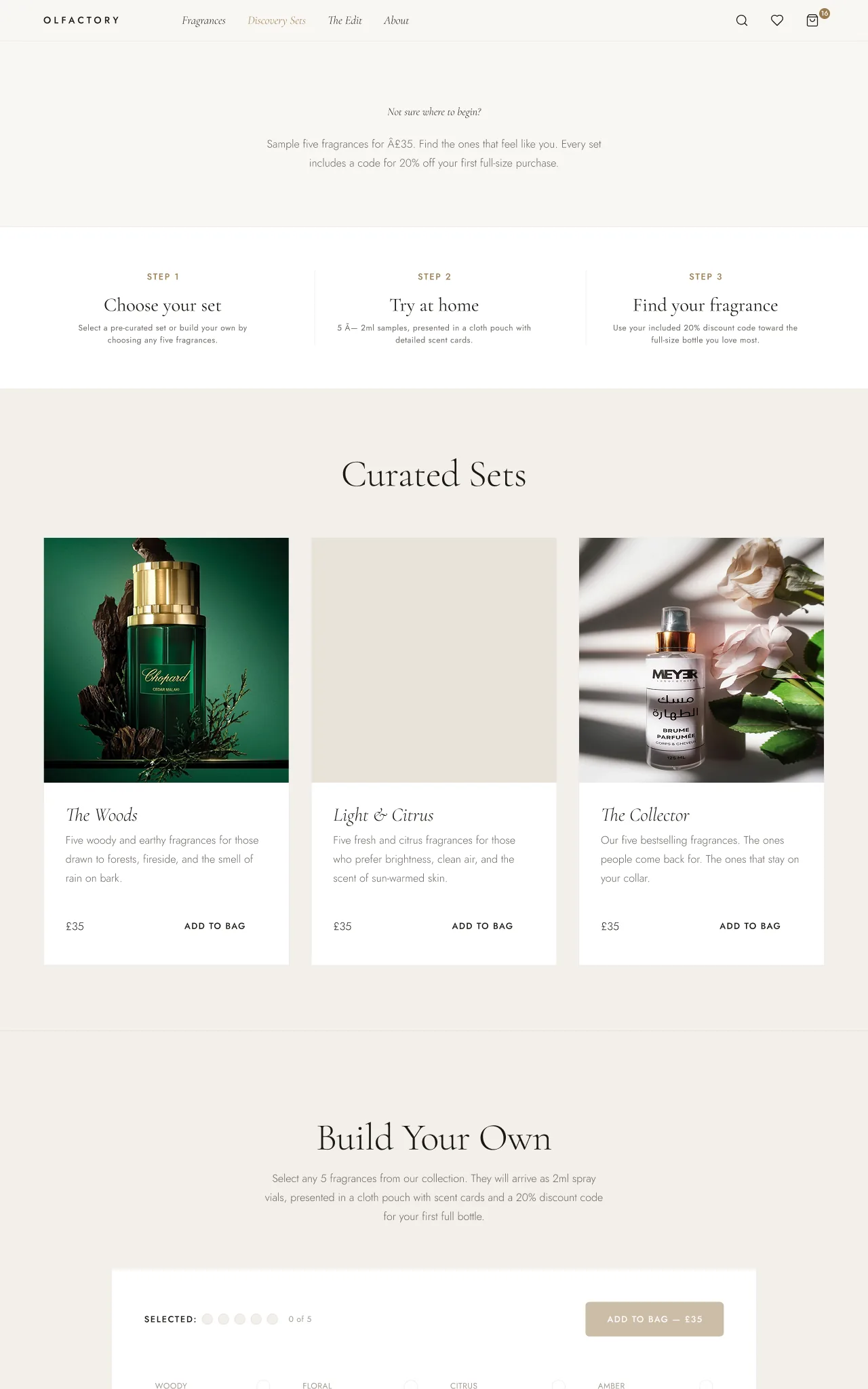
The sample sets page with curated sets and the set builder
02

A set of five samples instead of a sale

Why

Five samples for thirty five pounds lowers the risk of a first order. The set includes twenty percent off a full bottle, so the range is never discounted.

What it cost

The set has its own page and a builder: take a ready made set or pick any five.

03

The price never disappears and shifts the layout

Why

Many product grids swap the price for an add to bag button on hover, and the layout jumps under the cursor.

What it cost

Price and button share one fixed height slot and fade between each other, so the grid never moves.

04

A serif for the perfume, a sans for the shop

Why

The perfume needs a romantic voice and the checkout needs a practical one.

What it cost

Cormorant Garamond holds the names, the notes and the writing about each scent. Jost handles prices, labels, navigation and every form field.

05

Gold, and nothing else

Why

One accent keeps the paper and ink palette quiet so the photography leads.

What it cost

Gold is also the focus outline, set once for the whole site, so every interactive element has a visible focus state.

THE SCREENS

The bag

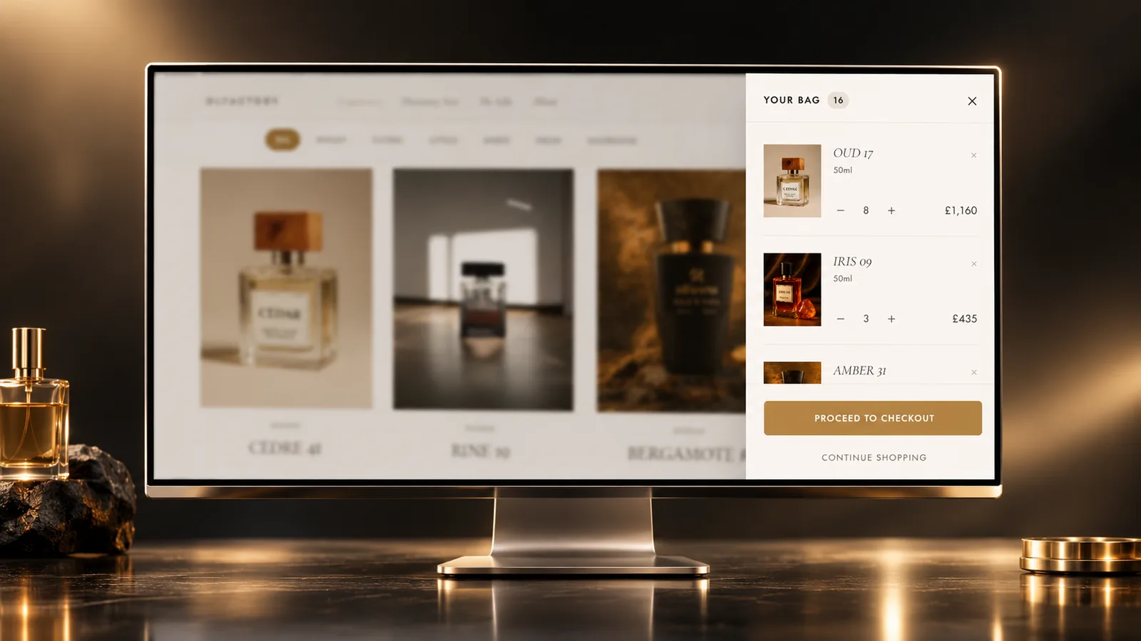
The bag drawer open over the fragrance grid
The bag opens as a drawer over the page you were on.

THE DESIGN SYSTEM

The pieces it is built from

Paper and ink with one gold accent, and a firm split between the typeface for the perfume and the typeface for the shop.

Colour

Off white#f9f7f4Page ground
Surface#f2efe9Cards and panels
Surface deep#e8e3daRules and wells
Ink#1a1814Primary text
Ink secondary#6b6560Body and support
Ink tertiary#a09890Small labels
Gold#9a7c4fAccent and focus
Gold light#f5ede0Accent ground, selection
Gold hover#7d6338Interactive states

Typography

The perfume

Cormorant Garamond

Names, notes and scent descriptions. Weights 300 to 600 with italics, headings at 300 with tight line spacing.

The shop

Jost

Prices, labels, navigation, buttons and forms. Weights 300 to 500.

Rules I stuck to

  • Every colour and spacing value is set once as a CSS variable, including section rhythm.
  • One gold focus outline for the whole site.
  • Fade ins use plain CSS keyframes, with no animation library or scroll listener.

THE LIVE PRODUCT

Have a look at the real thing

This one is live, not a mockup. Open it and you are looking at the decisions above, running.

olfactory-fragrance.vercel.app/
Olfactory Fragrance, the deployed site Open the live site

HOW IT WAS BUILT

How it was built

Design
Figma
Frontend
Next.js 14TypeScriptTailwind CSS
State
Zustand
Motion
CSS revealsFramer Motion
  • The system was set before any code: one off white, one ink, one gold, and no other colour. Twelve fragrances, eight pages and a four step checkout were specified first.
  • Cormorant Garamond never appears below eighteen pixels, where it stops being readable. Everything smaller is Jost.
  • Motion is limited to a fade up on entry, a stagger across grids, a slow zoom on hover and a sliding drawer. No bounce, spring or parallax.
  • Design tokens are CSS variables read by Tailwind, so design and code share one set of values.
  • Section spacing scales with screen width from one setting, with no spacing breakpoints.
  • The animation library is used only for the home page image. Everything else is CSS.

THE OUTCOME

Where it ended up

  • A shop where each perfume is introduced by its scent before its price.
  • A low risk way in for someone buying their first bottle, with credit towards a full size, and the price of the range left alone.
  • A product grid that never shifts on hover.
  • A documented type system new pages can follow without the design file.
Download CV