All projects

CASE STUDY

Thread

An AI relationship CRM for sales teams

A CRM where every health score, next step and summary says how sure it is, why, and how to fix it.

Role
Product designer
Timeline
Two months
Disciplines
Desk research, information architecture, flows, interface design, design system, prototype

THE PROBLEM

Where this started

Thread is a relationship CRM concept for B2B account teams. It scores the health of each relationship, suggests the next step, summarises every email and call, and keeps contact profiles up to date. The design problem was how to show an AI's guess so people trust it enough to act on it, and can push back when it is wrong.

  • 01AI CRMs already explain their scores. Salesforce lists the factors behind a score and HubSpot shows the top five, but neither says how sure the model is, so a score built on one call looks exactly as certain as one built on six months of contact.
  • 02Correcting the AI is close to impossible. HubSpot scores are for information only, and Affinity's relationship strength cannot be configured, so a rep who knows a score is wrong has nowhere to say so.
  • 03When wrong and right output look the same, people stop trusting all of it.
THE DECISIONS

What I decided, and why

Each decision, why I made it, and what it cost.

A queue row showing the confidence stitches and word
01

Confidence on every output, in words as well as a mark

Why

Without a confidence level, a rep either trusts every prediction or ignores them all.

What it cost

Each output carries three stitches and a word: confident, fairly confident or unsure. It adds an element to every row, so it stays small unless Thread is unsure.

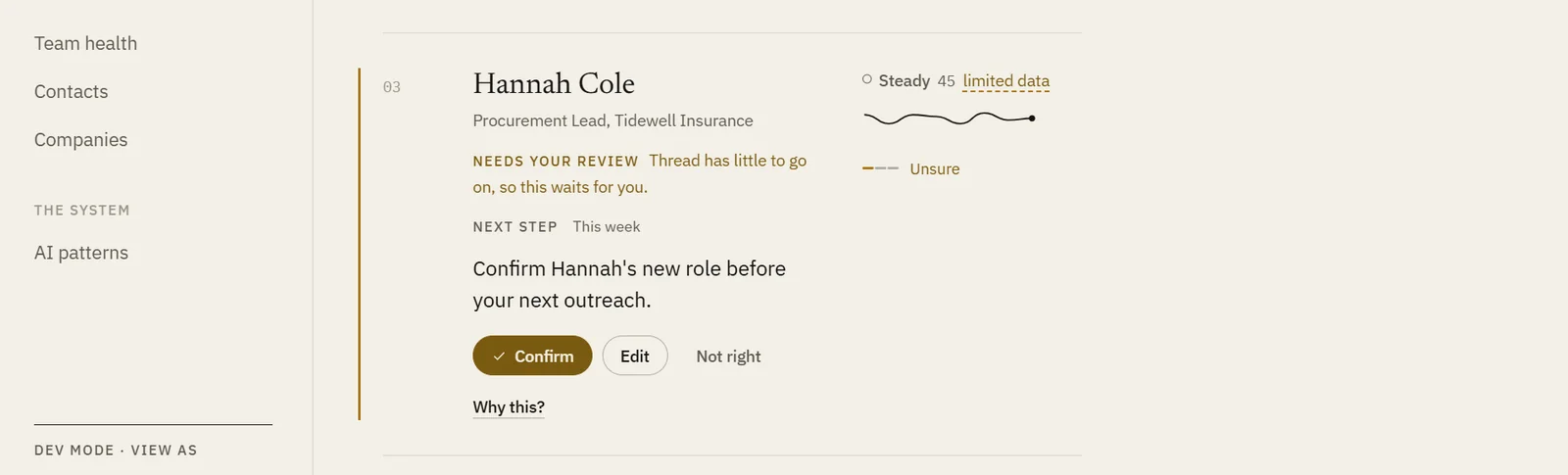
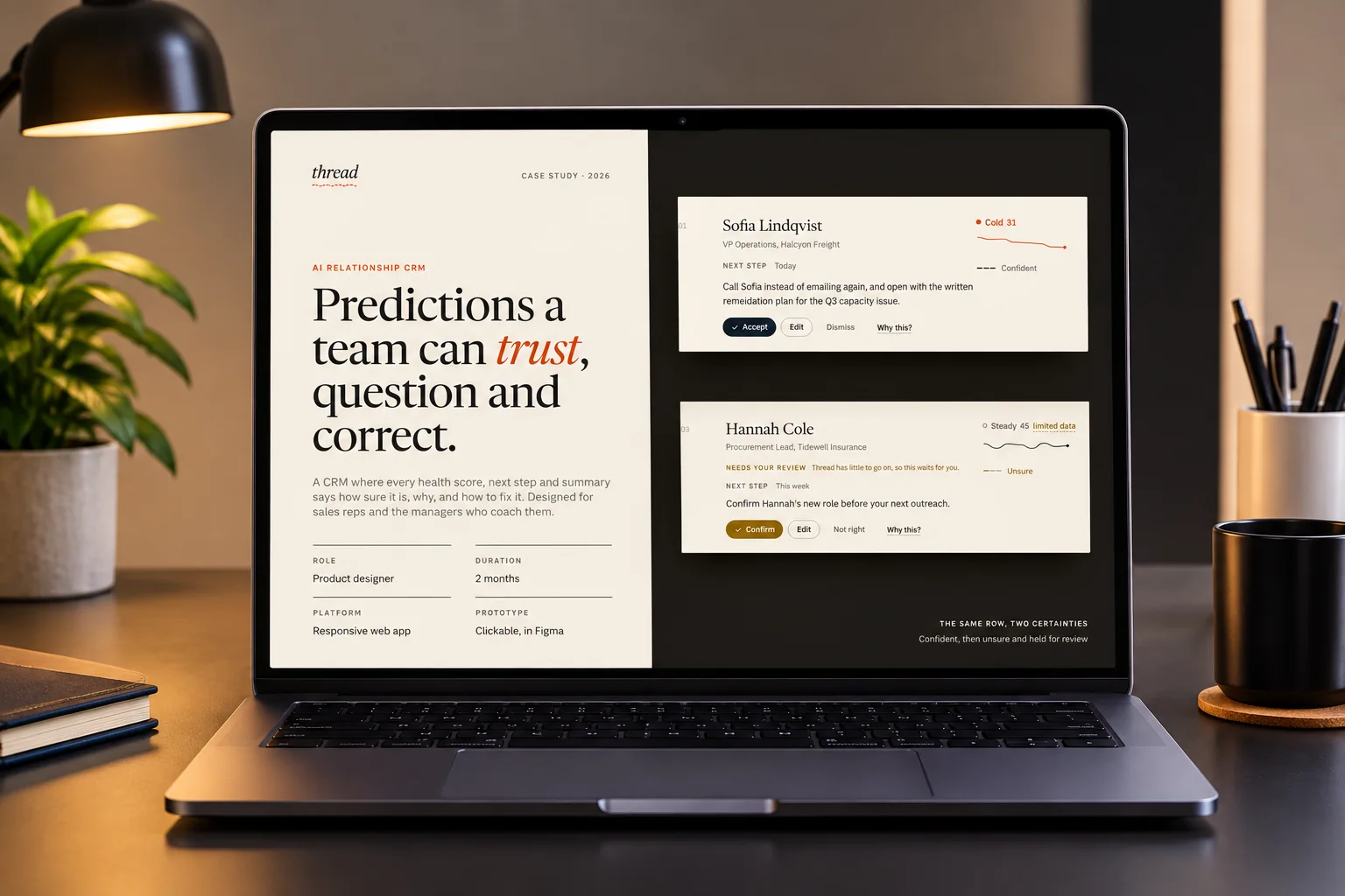
An unsure suggestion held in ochre with Confirm and Not right
02

When Thread is unsure, it waits for a person

Why

Thin data still produces a confident looking number, so low confidence suggestions should wait for a person.

What it cost

Unsure suggestions show in ochre, with Confirm and Not right instead of Accept and Dismiss. It adds a click, on purpose.

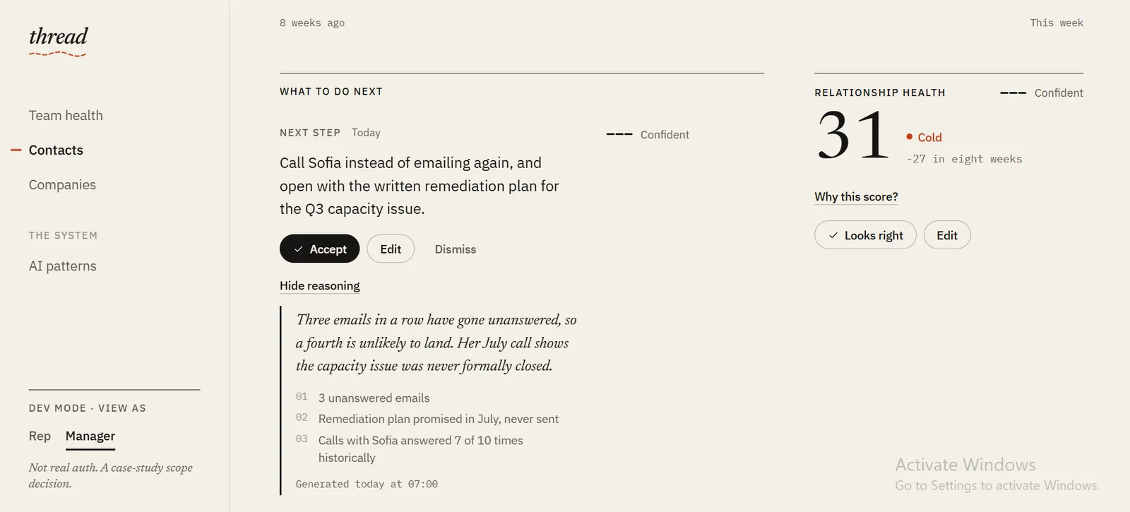
The Why this panel open on a suggestion
03

"Why this?" is one click away, in plain language

Why

A list of field names is not a reason. A plain sentence lets a rep judge a suggestion in seconds.

What it cost

Each output opens to one sentence of reasoning, the signals used and when it was generated. Every explanation has to be written in plain language, which is more work than listing factors.

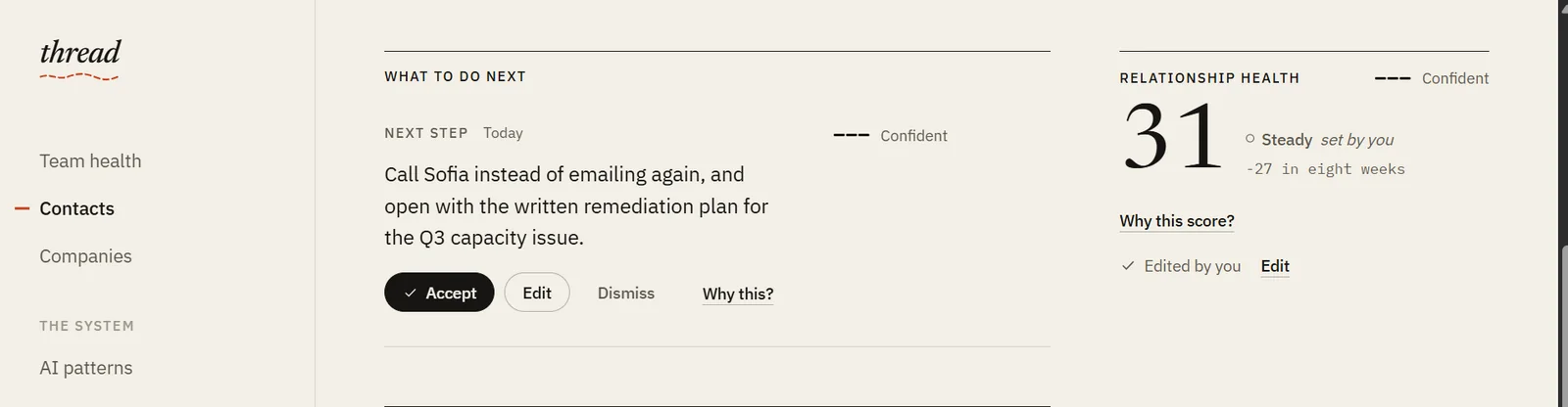
An edited suggestion marked set by you
04

Correction happens in place, and it stays visible

Why

If fixing the AI takes longer than ignoring it, people ignore it. If a fix disappears, managers cannot see where the AI is being overruled.

What it cost

Accept, edit, dismiss and undo sit on the output itself, and an override is marked set by you. Every AI component now needs four states instead of one.

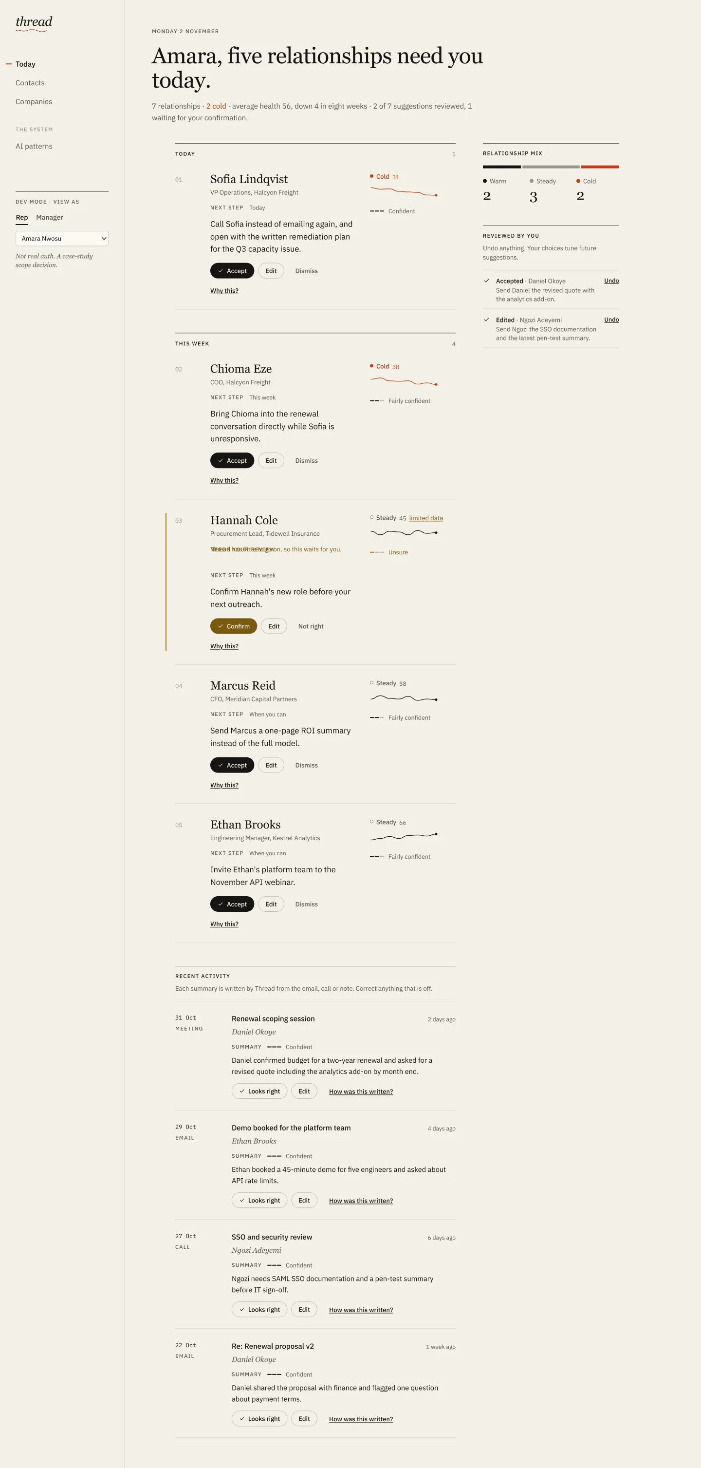
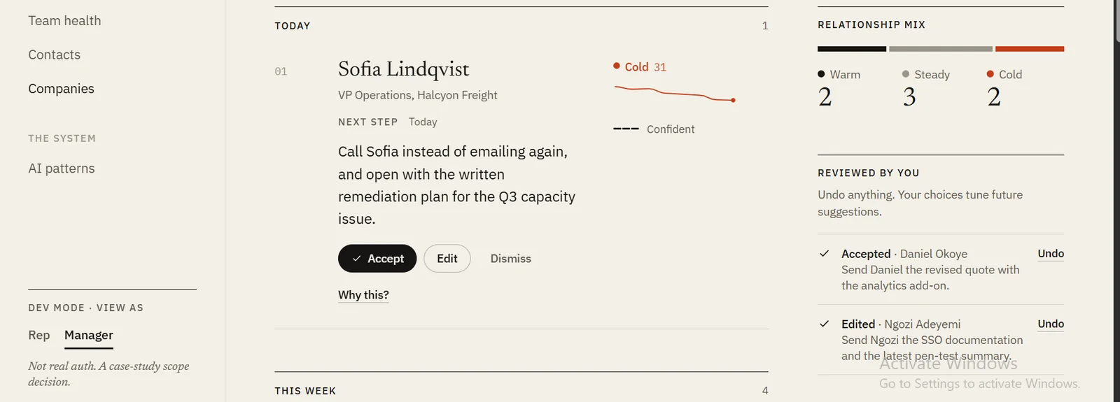
The Today queue
05

A queue of five, not a list of twenty five

Why

A rep starting the day needs a short ranked list, not a table sorted by score.

What it cost

Today is a numbered queue ranked by urgency and then health, grouped into today and this week. Less is visible at once, so the full directory stays one click away.

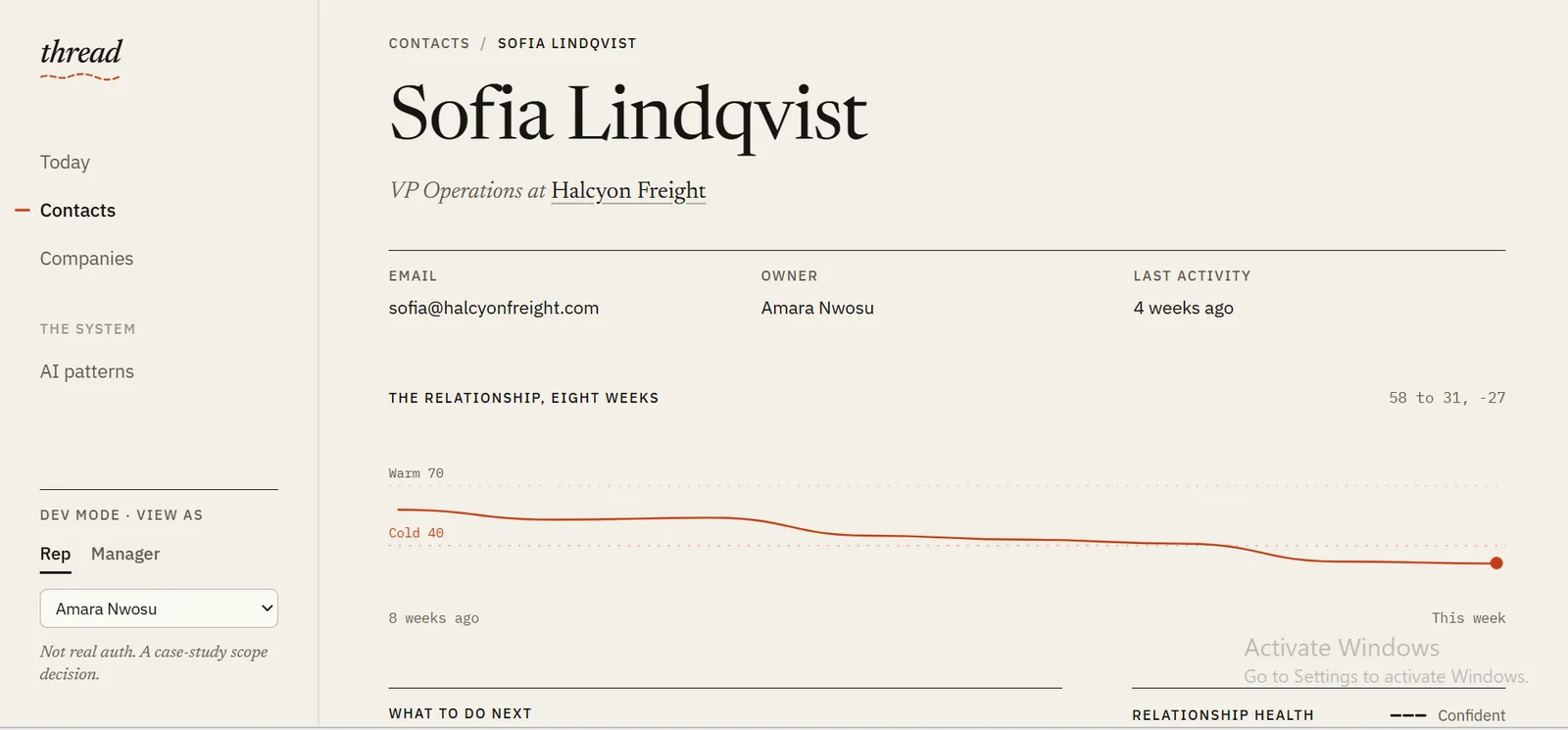
A contact page with the eight week health line
06

Every relationship drawn as a thread

Why

A single score says where a relationship is, not where it is going. Sofia at 31 matters because she was at 58 eight weeks ago.

What it cost

Each contact opens on an eight week health line with warm and cold thresholds, turning signal red when it cools. A line is less precise than a chart with axes, so the exact score and its change sit right beside it.

THE SCREENS

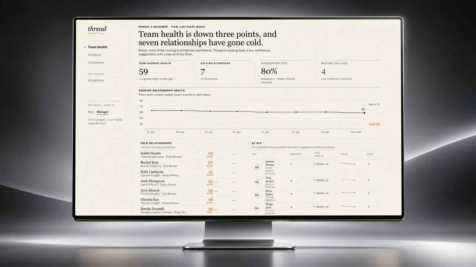
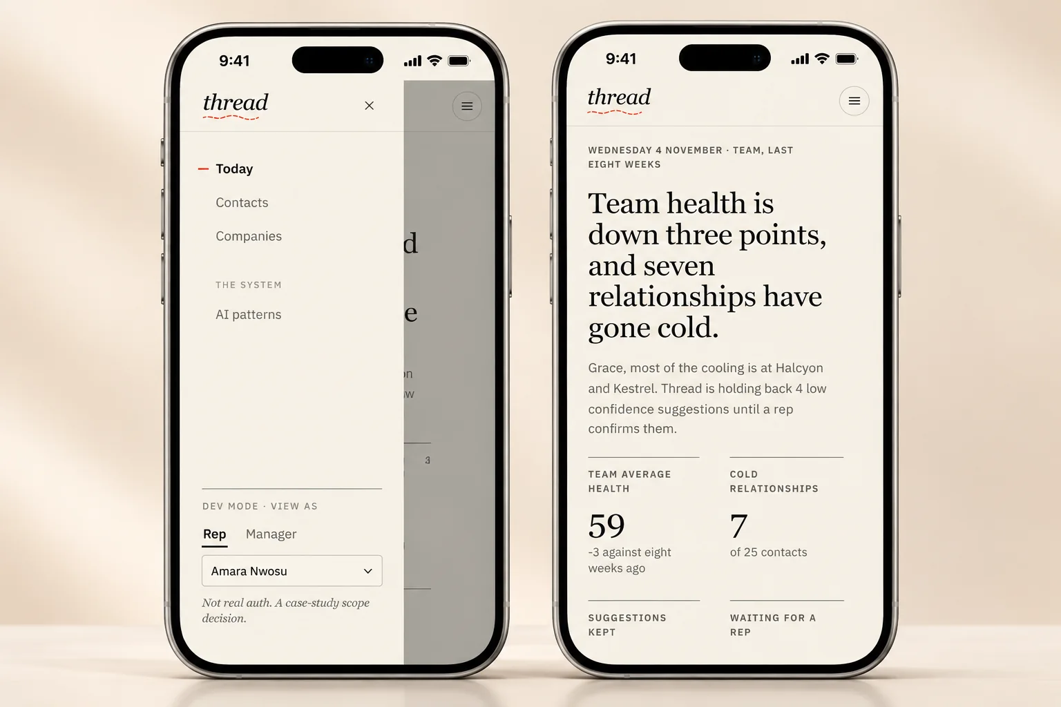
The two roles, on screen

The manager's view of the team, and the same product on a phone.

Team health, the manager's view of cooling accounts
Team health. A manager finds a cooling account and the rep behind it.
Thread on a phone, with the sidebar as a menu drawer
On a phone, the sidebar becomes a drawer and ledgers become stacked rows.

THE FLOW

What happens to one suggestion

Every health score, next step and summary follows the same path. The branch that matters most is the one where Thread is not sure.

  1. 01

    Thread makes a suggestion and rates its own confidence

    The rating is shown as three stitches and a word on the suggestion itself, so it is read before any action is taken.

    • Confident or fairly confident

      Shown in the queue with Accept, Edit and Dismiss.

    • Unsure

      Held back in ochre with Confirm and Not right, so a person decides before anything happens.

  2. 02

    The rep can ask why

    "Why this?" opens a plain sentence of reasoning, the signals it used and when it was generated. It is optional, one click, and never blocks the action.

  3. 03

    The rep acts on it, in place

    • Accept

      The suggestion is applied, with Undo still available.

    • Edit

      The rep's version replaces it and is marked set by you, so the override stays visible.

    • Dismiss

      It leaves the queue, with Undo still available.

  4. 04

    The manager sees where the AI is overruled

    Because overrides stay marked, a manager on Team health can find a cooling account, the rep behind it, and whether the AI's read is being trusted.

HOW I WOULD TEST IT

What I would test first

Thread is a concept and has not been tested with sales teams yet. These are the questions a first round would answer, and what each answer would change.

01

Do reps treat an unsure suggestion differently from a confident one?

How

Five account executives clear a seeded Today queue in the prototype, with one wrong suggestion marked unsure and one marked confident.

What would change the design

If they accept the unsure one as quickly as the confident one, the confidence mark is too quiet and needs more weight on the row.

02

Is "Why this?" understood without being explained?

How

Ask each rep to explain a health score in their own words after opening it, with no introduction to the feature.

What would change the design

If the explanation is read back as a list of fields rather than a reason, the reasoning sentence is doing too little and the signals too much.

03

Does a queue of five hide something urgent?

How

Seed an urgent account at position seven and see whether reps find it before the session ends.

What would change the design

If most miss it, the cut off at five is too aggressive and this week needs to surface higher.

THE DESIGN SYSTEM

The pieces it is built from

Warm paper, dark ink and one signal colour. A serif for people and decisions, a sans for the interface.

Colour

Paper#f3efe6Page ground
Surface#fbf9f4Fields and raised panels
Paper deep#ebe5d8Tracks and quiet fills
Ink#161513Text and primary actions, 15.9:1
Ink soft#5d5850Secondary text, 6.15:1
Ink faint#9a948aDecoration only, never text
Signal#c43d18Cold, cooling and emphasis, 4.54:1
Verify#a8741aLow confidence graphics
Verify text#7a5a10Low confidence text, 5.55:1

Typography

People and decisions

Newsreader

Names, headlines, health scores and the AI's reasoning, which is set in italic so it always reads as Thread speaking. Optical sizing keeps it crisp from fourteen to seventy two pixels.

The work

IBM Plex Sans

Interface text, recommendations, buttons and the small caps labels. Built for dense, functional screens, which is what a CRM is.

Numbers

IBM Plex Mono

Scores, dates, deltas and chart axes, so figures line up in a column and read as data rather than prose.

Rules I stuck to

  • Signal red is reserved for cold relationships and a cooling thread. Ochre is reserved for needs your review. Nothing else gets colour.
  • Colour is never the only cue. Health is a shape, a word and a number, and confidence is stitches and a word.
  • Hairline rules instead of cards, so twenty rows of AI output feel calm rather than busy.
  • Thread says suggests, never knows, and states doubt instead of hiding it.

THE PROTOTYPE

Walk through the prototype

Thread was designed as a clickable Figma prototype. Start as the rep on Today or as the manager on Team health, and question, accept or correct any suggestion along the way.

figma.com / Thread prototype
Thread, the same suggestion shown confident and then unsure Open the prototype

HOW IT WAS DESIGNED

How it was designed

Design
FigmaFigJamClickable prototype
Research
Desk researchCompetitive analysisProto-personasJourney map
Platform
Responsive web, desktop first
  • Discovery started with seven questions about how AI CRMs present a prediction, answered from the public help documentation of Salesforce Einstein, HubSpot, Attio and Affinity. Explanations were common, confidence levels were rare, and correction was almost absent.
  • Two proto-personas came out of that research. Amara, a senior account executive deciding where to spend her morning, and Grace, a head of account management who needs to see where the team is cooling and whether the AI is trusted.
  • The confidence, explainability, correction and language rules were written before the screens, then built once as shared components, so every surface that shows AI output behaves the same way.
  • The unsure state was designed first, because it shaped the components more than the confident one.
  • Thirteen desktop screens were wired into a prototype with one frame per state, so any contact or company row opens the screen that matches its state rather than one screen per record.

THE OUTCOME

Where it ended up

  • A clickable prototype covering both roles end to end: a rep working through today's queue, and a manager finding a cooling account and the rep behind it.
  • A shared pattern library of four rules for anything Thread writes: confidence is always shown, explainability is one click away, every output can be corrected, and language is plain and hedged.
  • A responsive layout where the sidebar becomes a menu drawer and ledgers become stacked rows on a phone.
  • A concept. The research came from public product documentation, and the personas are hypotheses.
Download CV